


Client
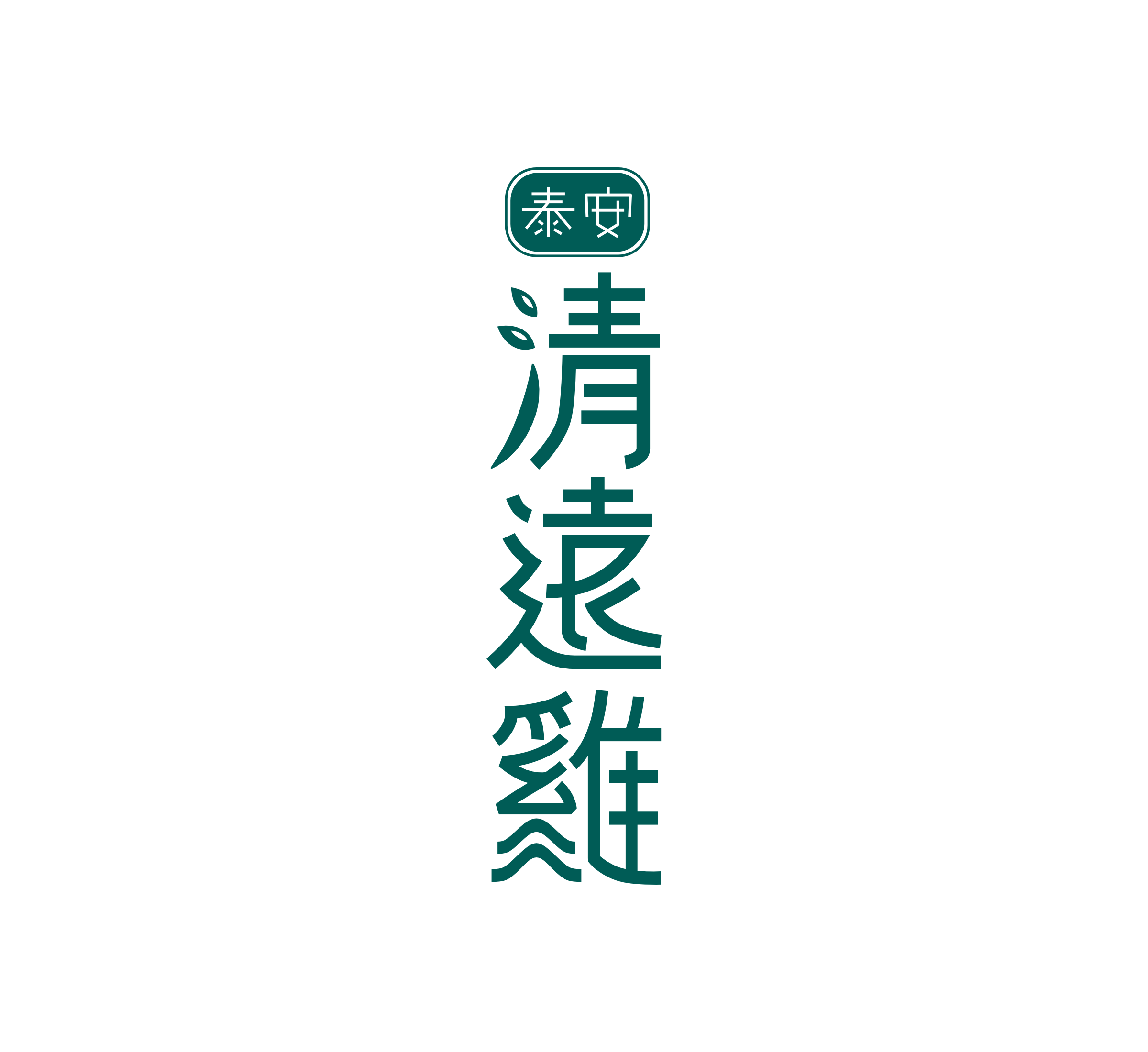
TAION Chicken (泰安雞)
Project Background
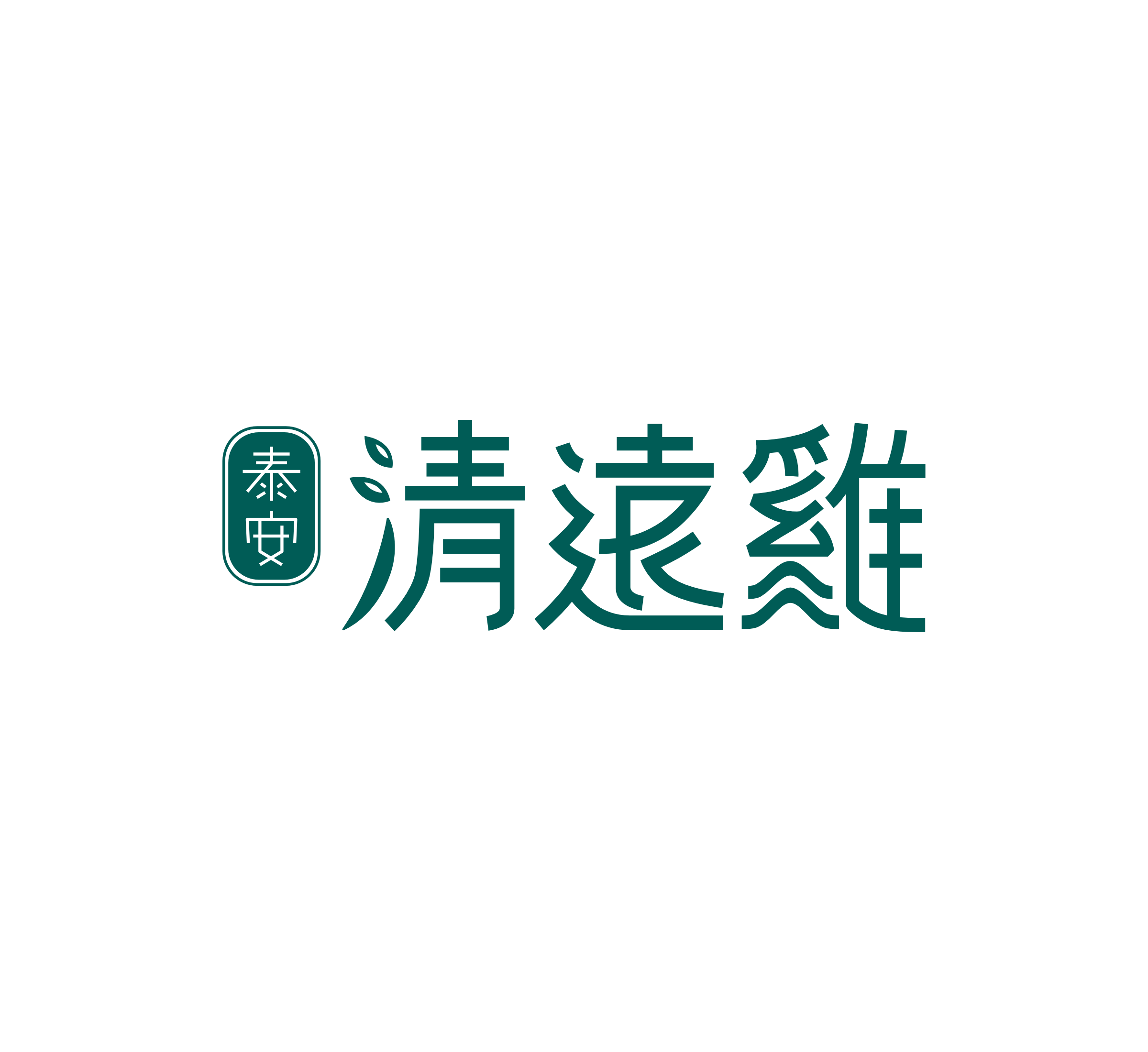
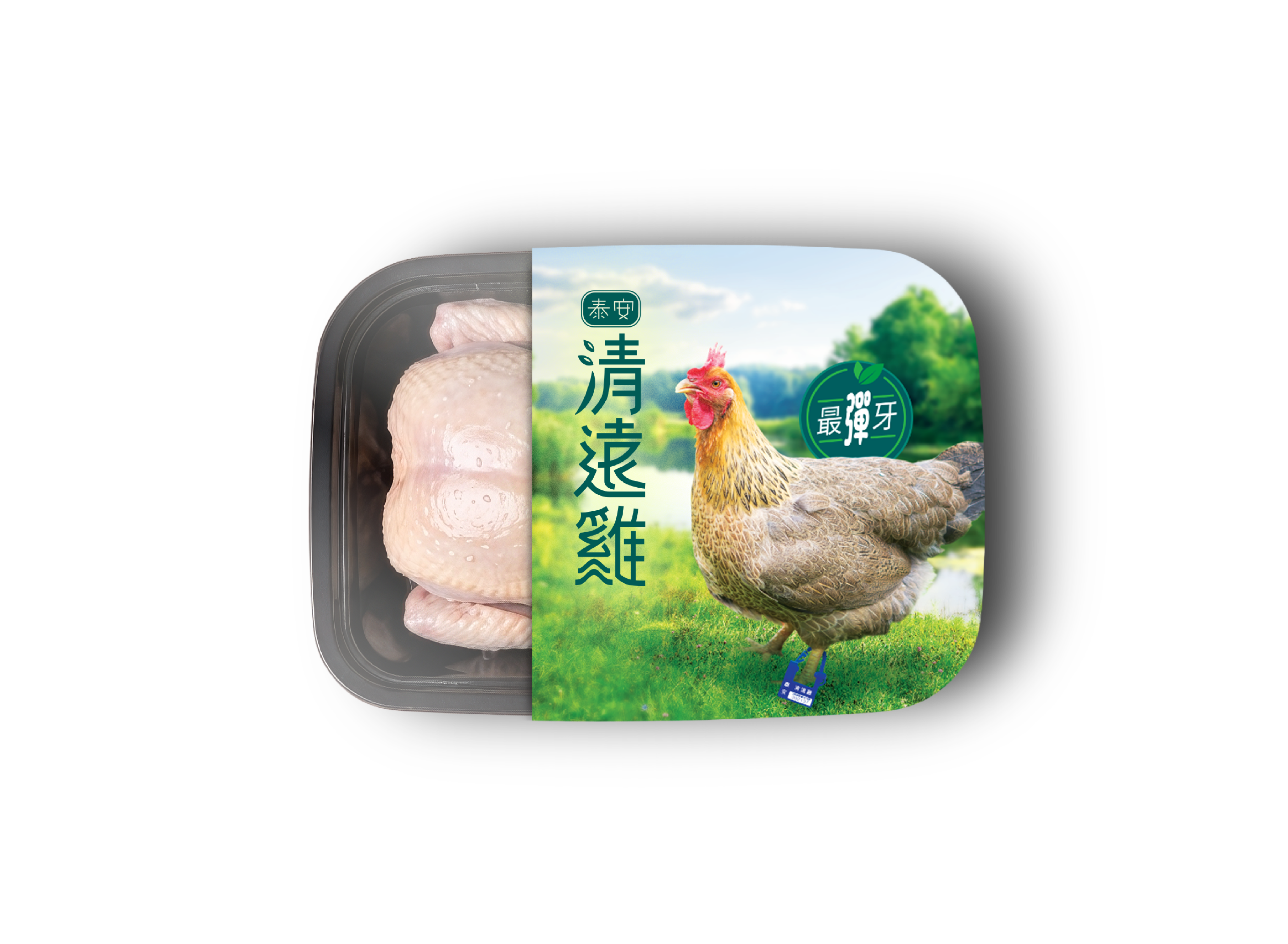
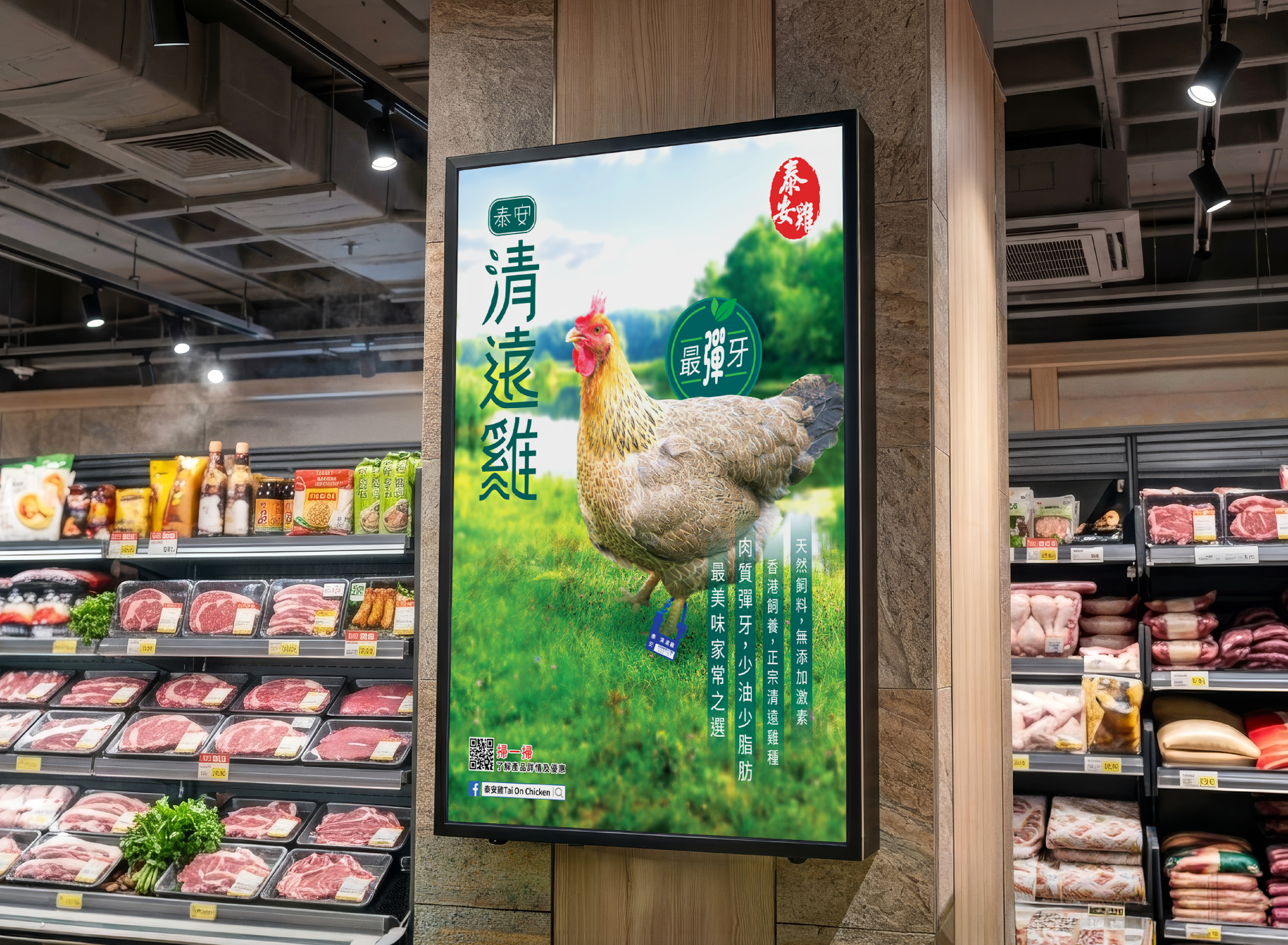
TAION Chicken needs a modern logo for their signature product, TAION Qingyuan Chicken, with the marketing strategy of transitioning from wet markets to supermarkets, targeting young housewives. The logo features leaf and mountain elements, symbolizing pure, hormone-free chicken with a firm texture from free-range farming. I created a fresh, approachable identity reflecting quality and heritage, tailored to contemporary consumers.
- Design Concept -

1/ Leaf Element
Tai On Qingyuan Chicken is pure, with no added hormones.

2/ Mountain Element
Tai On Qingyuan Chicken has firm, chewy texture, sourced from free-range mountain farming.

- Vertical lock up -
- Horizontal lock up -
- Stationary -
Softwear


My Role
Research Brand Identity
Concept Development
Digital Drafting
Select Colors Palette
Create Final Logo

852-5632 9301

© 2018-2025 Kay Chan.
All Rights Reserved.

Client
TAION Chicken (泰安雞)
Project Background
TAION Chicken needs a modern logo for their signature product, TAION Qingyuan Chicken, with the marketing strategy of transitioning from wet markets to supermarkets, targeting young housewives. The logo features leaf and mountain elements, symbolizing pure, hormone-free chicken with a firm texture from free-range farming. I created a fresh, approachable identity reflecting quality and heritage, tailored to contemporary consumers.
- Design Concept -

1/ Leaf Element
Tai On Qingyuan Chicken is pure, with no added hormones.

2/ Mountain Element
Tai On Qingyuan Chicken has firm, chewy texture, sourced from free-range mountain farming.
- Vertical lock up -
- Horizontal lock up -
- Stationary -
Softwear

My Role

Research Brand Identity
Concept Development
Digital Drafting
Select Colors Palette
Create Final Logo

852-5632 9301

© 2018-2025 Kay Chan. All Rights Reserved.
Client
TAION Chicken (泰安雞)
Project Background
TAION Chicken needs a modern logo for their signature product, TAION Qingyuan Chicken, with the marketing strategy of transitioning from wet markets to supermarkets, targeting young housewives. The logo features leaf and mountain elements, symbolizing pure, hormone-free chicken with a firm texture from free-range farming. I created a fresh, approachable identity reflecting quality and heritage, tailored to contemporary consumers.
- Design Concept -
1/ Leaf Element
Tai On Qingyuan Chicken is pure, with no added hormones.
2/ Mountain Element
Tai On Qingyuan Chicken has firm, chewy texture, sourced from free-range mountain farming.
- Vertical lock up -
- Horizontal lock up -
- Stationary -
Softwear
My Role
Research Brand Identity
Concept Development
Digital Drafting
Select Colors Palette
Create Final Logo
852-5632 9301
© 2018-2025 Kay Chan. All Rights Reserved.